Discover the Top 10 Blue-Green Paint Colors That Designers Swear By
- Mar 31
- 4 min read
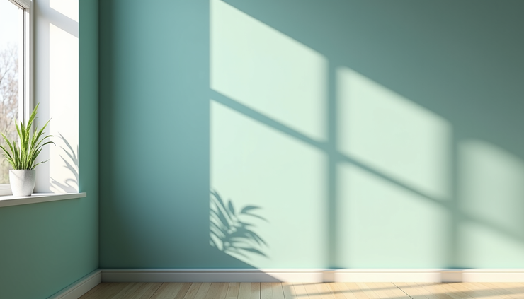
Blue-green paint colors have become a favorite among interior designers for their unique ability to bring calm, freshness, and a touch of sophistication to any space. These shades blend the tranquility of blue with the natural vibrancy of green, creating a versatile palette that works well in various rooms and styles. If you’re thinking about refreshing your walls with a color that feels both modern and timeless, DFW Story Group believes that exploring the best blue-green paints is a smart move.
This post highlights the top 10 blue-green paint colors that designers can’t stop using. Whether you want a soft, muted tone or a bold, dramatic hue, these colors offer options that suit different tastes and settings. Plus, you’ll find practical tips on how to use each shade effectively in your home.
Why Blue-Green Colors Are So Popular
Blue-green tones strike a perfect balance between cool and warm, making them adaptable to many design schemes. They evoke feelings of nature, water, and serenity, which helps create relaxing environments. Designers appreciate these colors because they:
Work well with both neutral and vibrant accents
Complement wood, metal, and natural textures
Suit a variety of rooms, from bathrooms to living areas
Offer depth without overwhelming a space
Understanding the subtle differences between the shades can help you pick the right one for your project.
1. Seafoam Green
Seafoam green is a light, airy shade with a hint of blue that feels fresh and inviting. It works beautifully in kitchens and bathrooms, where it adds a clean, crisp look without feeling sterile. Pair it with white cabinetry or natural wood for a coastal-inspired vibe.
2. Teal
Teal is a richer, deeper blue-green that adds drama and sophistication. It’s perfect for accent walls or statement pieces in living rooms and bedrooms. Teal pairs well with gold or brass fixtures, creating a luxurious atmosphere.
3. Aqua
Aqua leans more toward blue with a bright, cheerful tone. It’s ideal for spaces that need a pop of color without being too bold. Use aqua in children’s rooms or creative spaces to inspire energy and creativity.
4. Turquoise
Turquoise is a vibrant, tropical shade that brings energy and warmth. It works well in sunrooms or outdoor spaces, connecting the indoors with nature. Combine turquoise with sandy neutrals and leafy greens for a refreshing look.
5. Mint Green
Mint green is a soft, pastel blue-green that feels calm and soothing. It’s a popular choice for bedrooms and nurseries because of its gentle, restful quality. Mint pairs nicely with soft grays and creams for a peaceful palette.
6. Peacock Blue
Peacock blue is a dark, intense shade with strong blue undertones. It adds depth and richness to any room and is often used in dining rooms or libraries to create a cozy, elegant feel. Use it with dark wood and leather accents for a classic look.
7. Robin’s Egg Blue
Robin’s egg blue is a delicate, slightly muted blue-green that feels vintage and charming. It’s great for cottage-style interiors or shabby chic designs. This color works well on walls or furniture pieces to add subtle character.
8. Jade Green
Jade green is a medium, earthy blue-green with a natural, grounded feel. It’s versatile enough for living rooms, kitchens, or even exteriors. Jade pairs well with natural stone and greenery, enhancing a connection to the outdoors.
9. Viridian
Viridian is a deep, slightly bluish green that feels both modern and timeless. It’s a favorite for accent walls and cabinetry, offering a bold yet sophisticated look. Viridian works well with white trim and metallic accents.
10. Celadon
Celadon is a pale, muted blue-green with a soft, almost gray undertone. It’s perfect for creating serene, understated spaces. Use celadon in bedrooms or bathrooms to promote relaxation and balance.
How to Choose the Right Blue-Green for Your Space
When selecting a blue-green paint, consider the following:
Lighting: Natural and artificial light can change how the color appears. Test samples in different lighting conditions.
Room size: Lighter shades can make small rooms feel larger, while darker shades add coziness to bigger spaces.
Existing decor: Match or contrast with furniture, flooring, and accessories to create harmony or visual interest.
Mood: Decide if you want a calming, energizing, or dramatic effect and choose your shade accordingly.
Tips for Using Blue-Green Paint Colors
Use blue-green shades as a backdrop for natural materials like wood, stone, and plants.
Combine with warm metals like brass or copper to add warmth.
Layer different shades of blue-green for a monochromatic look with depth.
Balance bold blue-greens with neutral furnishings to avoid overwhelming the space.
Exploring these top blue-green paint colors can help you find the perfect shade to refresh your home. For more inspiration and detailed color recommendations, check out the full article at Elle Decor. Scan the QR code below to go there!


